Friday, February 22, 2013
Readings on Printing - please read by Tuesday
Please read the the second part of this handout about ink jet printing. I wrote it several years ago, but the information is still valid.
Also, please read this Printing Guide for the 4800.
On Tuesday, I will provide an overview of inkjet printing and we will do some demos on dodging and burning for B&W images.


Monday, February 18, 2013
First Contact exhibition reception this Friday February 22nd from 6-9pm

 |
|  | |||||||||||||||||||
||
 |
|  | |||||||||||||||||||


Thursday, February 14, 2013
It's Black, It's White, Woohoo
The first thing you should do when preparing to convert your image to black and white is to first make a very nice color version of the image. Of special importance is the color correction/determination of correct white balance. Most of the methods used to convert an image to black and white are based on assigning tone based on color. If there is a color cast, then this will make it harder to make targeted edits to tone based on color.
Here is the handout that I wrote up back in 2006. It is a little dated, but most of it still applies. It covers many of the techniques that I demonstrated in class. All that is missing is the conversion available via Camera Raw and the Black and White tools within Photoshop proper.
Being a UT student, you have access to the wonderful resources that the University of Toledo library offers students in the form of online books. If you connect to the internet via a UT connection, you will not have to sign in. If you are at home, then you will have to sign in using your name and R number. I will try to remember to demonstrate how to do this in class tomorrow.
To access the online books through UT's library system, begin by going to:
Go to the Quick Links section and run a search on the relevant subject matter, let's say Photoshop Pen Tool. Look over the books . You will see that most of them have an ebook icon on to the right of the listing. You will see a link just below the book title which says Connect to Electronic Resource. This will take you to the book within Safari Books Online. You will see a large blue button which says Start Reading.
Or go directly to the search by going to:
Additional reading on Converting images to Black and White - please read these online books available via the library by Wednesday
Real World Digital Photography, 2nd Edition, pp. 556-567, well written section on converting to black and white and some novel means to toning images. I used to use this book as the assigned textbook at Owens. A bit dated now, but still an excellent read. Digital Infrared Photography, Chapter 5, we will briefly discuss digital infrared in the near future, but this book covers some interesting digital conversions to grayscale some of which are specific to IR images.
Mastering Digital Black and White: A Photographer’s Guide to High Quality Black-and-White Imaging and Printing Chapter 5, the Color to Black and White section which discusses the Calculations method of conversion.
Here are some links to tutorials on using the Dodge and Burn technique that I will demonstrate next week
Non-Destructive Dodge and Burn in Photoshop
Why dodge and burn?.
Here is an article about why you might want to Dodge and Burn.
Here is an article about using the Gradient Map method to convert an image to B&W.
Here is an article about using the Gradient tool to make a sky darker.
Here is an article demonstrating multiple ways to split tone an image.
Here is another about multiple ways to add a Sepia tone to an image.
I will demonstrate Quadtone RIP for you one at some point in the next few weeks.
Thursday, February 7, 2013
Homework
For your next project, you will create an image dealing with the notion of an individual's idea of sacred space.
Essentially, you are going to take a portrait of someone and then combine it with a photo of the space that is sacred to them. You will combine it to make it look good. The technical aspects are really pretty easy.
I would like you to follow this link and watch the video to more fully understand the process. If your camera doesn't support multiple exposure, or you don't want to combine them in camera, then you can combine them in your image editing application.
Also, shot an image to be combined for the Trichromy assignment.
You don't need to perform any editing. We will do that in class on Tuesday. Have fun!
Essentially, you are going to take a portrait of someone and then combine it with a photo of the space that is sacred to them. You will combine it to make it look good. The technical aspects are really pretty easy.
I would like you to follow this link and watch the video to more fully understand the process. If your camera doesn't support multiple exposure, or you don't want to combine them in camera, then you can combine them in your image editing application.
Also, shot an image to be combined for the Trichromy assignment.
You don't need to perform any editing. We will do that in class on Tuesday. Have fun!
Tuesday, February 5, 2013
Using Pepakura Viewer on a Mac....
UT offers a 'virtual computer' experience to allow students and faculty access to the programs and services of a UT computer lab. They call it VLab. To use it, you must download and install the Virtual Lab client.From that site, you then follow the link to launch the virtual lab. It will always be a Windows 7 environment.
You can install programs within the VLab environment. Thus, you can install Pepakura Viewer on VLab. FYI- once you log out of a VLab session, the program that you installed previously will disappear.
Pepakura Viewer is the free utility that will allow you to open up your Pepakura file (.pdo) and facilitate your models assembly. You can download it to your virtual desktop.
To access your .pdo file you have to first save it somewhere online. You could use Google Drive or your H drive. UT supplies all its students with some space on their file server. This is always available to you as your H drive. Below is a screenshot of how to upload your files to H drive.
 In summary, you can use Pepakura Viewer (or Pepakura Designer for that matter) on a Mac using the Virtual Labs service. Below is a screenshot of Pepakur Designer running on a VLab virtual computer (FYI- that isn't my Tron model. You can download it here).

You can install programs within the VLab environment. Thus, you can install Pepakura Viewer on VLab. FYI- once you log out of a VLab session, the program that you installed previously will disappear.
Pepakura Viewer is the free utility that will allow you to open up your Pepakura file (.pdo) and facilitate your models assembly. You can download it to your virtual desktop.
To access your .pdo file you have to first save it somewhere online. You could use Google Drive or your H drive. UT supplies all its students with some space on their file server. This is always available to you as your H drive. Below is a screenshot of how to upload your files to H drive.


Tuesday, January 29, 2013
Trichromy - little fun assignment

I wanted to follow up with the trichromy images that I showed you in class on Monday. Depending of whether you have any background using PS or other image editors, you may find it tricky to complete, so it won't be officially assigned until later when you have had some time to become more familiar with technical aspects of editing photos. It's going to be a 'floating assignment' in that it you will need to do it eventually, but it isn't due for quite some time. That being said, I'm confident that a number of you are quite familiar with PS and similar apps and could follow these instructions very easily. So, if you are feeling ambitious or have some extra time, feel free to go for it now.
French write-up with some really nice examples of the trichromy process.
Article translated into English using Google Translate
One clever aspect of some of his images are that he isn't using a tripod, so the images are a little bit off as well which results in color fringing throughout the image. He could easily 'register' the images in an image editor, but I assume he likes the look (so do I).

Below is a really nice use of the process. Image is by Flickr user Budzillab.
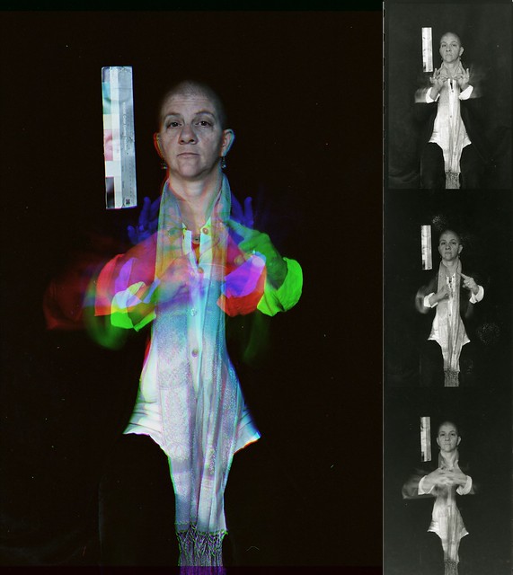
Even though this assignment is based on a technical/creative technique, I still want them to be great images. Please take some time and make a really strong image.

Background
Some of the earliest color photos were taken and exhibited before the advent of color film materials. Prokudin-Gorskii was one such photographer. The Library of Congress has an excellent website dedicated to his work which explains the process that he used. Eseentially, he would take one photo for the Red light, one for the Blue, and one for the Green using black and white film. Then he would project the resulting images from three different projectors one each for Red, Green, and Blue. This would reconstitute a full color image. This is not to dissimilar from how most digital cameras record color (more on that at another time).
Trichromy via Multiple RGB Exposures
You can get a similar effect by taking three separate exposures on the same piece of color film using a red, green, and blue (the primary additive colors) filters respectively. If you are shooting digitally, you can achieve the same effect by taking one channel from each image (red, green, blue) and combining them into a new image. The trick is that have to use a tripod to take three photos of a scene in which part of it has movement and part of it does not (or not depending on the look that you want). The trick is that you have to pre-visualize how the resulting image will look once composited.
How to combine the channels into one composite image
In order to combine them into one as shown above, you first edit one of them using Camera Raw (assumes you captured your images as RAW files). Then synchronize all three images. Then take one of the images, select the Red channel, right click it, select Duplicate Channel, Create New, name it Red. The basically do the same for the other two channels, taking the Green from one image and the Blue from another. These new images will be in a weird Multichannel Mode. Go to Image > Mode and change the mode to Grayscale for each of them. Save each of the three files to the same directory as TIFFs (I don't think that you have to do this, but it is a good idea should something go wrong). Then, go to one of the grayscale files, let's say Red. Make sure the other files are also open so you should have three files open now, one named Red, one named Green, and one named Blue. Select one of the images. Go to the Channels Palette. Hit the little hidden menu icon in the corner to revel the drop down menu. Select Merge Channels. Then select RGB Mode. Make sure it is set to 3 colors. Then hit OK. It should automatically list the three channels that will make up the color version. Make sure all 3 channels are indicated in the correct order. This will then give you full color image. Are that didn't move should look normal and those parts that moved will have different colors to them.
NOTE: You will get a slightly different look by changing the images from which you took the respective primary color from. That is to say, you can take the Red, Green, and Blue channels from a different one of the original color images. This will result in the colors being different.
Putting together a Trichromy image using GIMP
Similar thread about free programs that can do this...
Here is a tutorial which pretty much ends up with the same results, but goes about it differently. The article refers it as being a Harris Shutter Effect. This process is really more like early color photography than a Harris Shutter as it requires three exposures; one through each of the primary additive colors: Red, Green, and Blue. A Harris shutter is used during a single exposure. It's goal isn't to create a normal looking image, rather to create a full color image with some funky color fringing. Here is a write up on creating a real Harris Shutter.
Have fun with this assignment!
Sunday, January 27, 2013
Importance of editing your photos before uploading them to 123D Catch
You must edit your photos to the absolute best of your abilities before uploading them to 123D Catch. If you don't your model isn't going to go together well or possibly at all.
That is why I taught you to edit the images before uploading them.
Pay particular attention that you shadows have detail. If there isn't any detail in the shadows, then 123D Catch can't find shared points to match up the images.
That is why I taught you to edit the images before uploading them.
Pay particular attention that you shadows have detail. If there isn't any detail in the shadows, then 123D Catch can't find shared points to match up the images.
Subscribe to:
Posts (Atom)